This module covers the basics of working with raster and vector spatial data, using Python libraries rather than a desktop GIS. After completing this module you will learn how to load datasets into a notebook; check and modify coordinate reference systems; style a map based on attribute information; and perform basic (but powerful!) spatial joins. It repeats the first tutorial of Methods in Spatial Research, which did the same things in QGIS.
These concepts will be introduced through a series of studies of the trees of New York City.
If you have not worked with code before: Don't try to write everything out yourself, but rather copy the cells directly and try to understand the logic. It is totally ok to begin working with something that you do not totally understand, comprehension often then comes from trying to edit it.
Setup
File management
Create a new folder for your work on this series of modules. Inside it create a data folder and then an original and a processed folder. All downloaded datasets should be saved in the data > original folder. Any new datasets you create in the process of completing the modules should be saved within the data > processed folder. Colab forgets the files you upload when a session ends, so the copy on your own computer is the one that matters.
Data downloads
In this module you will be making a series of maps about NYC street trees. The following datasets are in the course folder, under the name of this tutorial:
- New York City Landcover 2010 (3ft version), clipped (
landcover_2010_um.tif). A raster dataset created to describe major land use categories for New York City derived from satellite imagery. The full dataset covers the whole city and is too large for a notebook, so I have clipped it to the same area of Harlem as the other two datasets. From the NYC Open Data page for the full dataset, also download the Data Dictionary:Landcover2010_DataDictionary_20171012.xlsx. - New York City 2015 Street Tree Census (
2015_Street_Tree_Census_subset_um.csv). This dataset was collected by more than 2000 volunteers visiting each street tree within the five boroughs of NYC. For more background on this amazing effort (the third such census over the past 30 years) see the NYC Parks department website here. The course folder has a subset of the data for an area in Harlem to make for easier processing. For those interested the full dataset is available for download directly via NYC Open Data here. - New York City Census Blocks 2010 (
nycb2010_um.gpkg). As with the street trees above, this is a subset of the full NYC Census Blocks file for an area of Harlem. I exported the blocks as a geopackage (.gpkg) so that we do not have to upload the several files that accompany a shapefile. The original dataset for all of NYC is available here.
The notebook
In this tutorial, we will use Google Colab to run our code. Colab is a programming environment that allows for the execution of Python code in the browser. We will use it here because it requires virtually no setup, but with slight modifications this code could run in any programming environment (see Running Python on Your Own Computer).
Open a new notebook and put this into the first cell. This imports all of the libraries that we will be using.
from google.colab import files

import numpy as np
import pandas as pd
import geopandas as gpd
import altair as alt
import rasterio
import matplotlib.pyplot as plt
Go ahead and run the cell. If import rasterio fails, it is not installed in this Colab session. Run this in a new cell and then run the imports again:
!pip install rasterio
Next, paste this code below into a cell.
uploaded = files.upload()
Run the cell and upload the three datasets (the .tif, the .csv and the .gpkg). Once you are done, you will see your datasets in the menu accessible via the folder icon on the left. Make sure you have all three files in there before you proceed, they may take a second to show up.
Adding raster data: mapping tree cover from land use
The first layer we will add to our project is a raster dataset of landcover for New York City from 2010. This dataset was developed by researchers using satellite imagery to identify major categories of materials (cement, buildings, open ground, water, vegetation, tree cover) for all of New York City.
We will use this layer to visualize the canopy of New York City's trees.
Open the file and look at its source and coordinate reference system information. This is always a good thing to do when you add a new dataset to your project.
src = rasterio.open('/content/landcover_2010_um.tif')

print(src.crs)
print(src.res)
print(src.bounds)
print(src.count, 'band(s),', src.width, 'x', src.height, 'cells')
Notice that the coordinate reference system is already defined as EPSG:2263 which refers to the New York State Plane Coordinate reference system for the Long Island region. This is the projected coordinate reference system that produces the smallest level of distortion for NYC and should be used for all local maps of NYC.
The resolution should be (3.0, 3.0). Remember for raster datasets each cell represents a specific area on the earth's surface (its cell size) and each cell has exactly one numeric value. Each cell is 3 feet. This matches the information conveyed in the metadata for the dataset.
Next let's examine the values contained in the raster cells. Read the band into an array and ask for the unique values:
landcover = src.read(1)

values, counts = np.unique(landcover, return_counts=True)
for v, c in zip(values, counts):
    print(v, c)
The meaning of these values is explained in the data dictionary provided with the data (see Landcover2010_DataDictionary_20171012.xlsx). Open this file from your data folder to take a look at it. Notice that cells with a value of 1 correspond to areas classified as within the 'tree canopy' for NYC.
Our goal in this part of the module is to design a map showing the tree canopy for New York City aka A View of NYC Trees #1.
In QGIS we did this by changing the symbology of the layer so that every value except 1 was white. Here we will make a new array that is True where the cell is tree canopy and False everywhere else, and draw that.
canopy = landcover == 1

plt.figure(figsize=(8, 8))
plt.imshow(canopy, cmap='Greens')
plt.axis('off')
plt.title('Tree canopy, 2010 land cover')
plt.show()
You should now see a map showing just those areas classified as tree canopy in this land cover dataset.
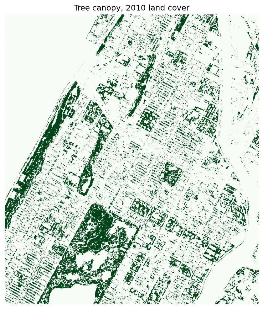
Because each cell is 3 feet by 3 feet, we can also count the canopy:
cells = canopy.sum()
acres = cells * 9 / 43560
print(f'{cells:,} canopy cells, about {acres:,.0f} acres, {canopy.mean():.1%} of the area')
Adding vector data: mapping tree concentrations
Next we will visualize a subset of New York City's trees through a different dataset and different set of methods. Throughout consider how this representation of NYCs trees differs from the approach using the raster dataset completed above? How are the two representations different? similar? which is more 'accurate'? (that's a trick question...)
In this section we will answer the question: which census blocks have the greatest number of street trees?
To do this we will add two new datasets to our project, a geopackage containing census block boundaries, and the 2015 street tree census for New York City.
To reduce processing times you will conduct the next section with a subset of data covering part of upper Manhattan (from 105th Street to 141st Street). This is the dataset you downloaded at the beginning of this tutorial module.
If you have a powerful computer (or don't mind waiting several minutes between steps) feel free to download the complete versions of the datasets for NYC as a whole.
- Download NYC Street Tree Census for all of NYC. Metadata available here.
- Download Census Blocks for all of NYC. Metadata available here.
Adding the street tree census
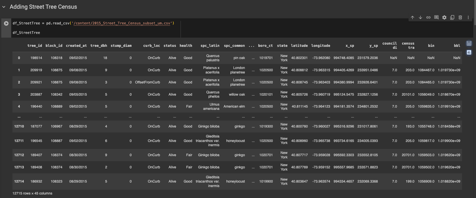
Now let's add our first dataset, put it into a dataframe, and check it out.
df_StreetTree = pd.read_csv('/content/2015_Street_Tree_Census_subset_um.csv')

df_StreetTree
What this snippet above does is read the csv that we uploaded, and store it as a dataframe. I have named this dataframe df_StreetTree, and in general df is often used as a prefix to note which variables are dataframes. This is relevant info if you ever go on stack exchange or use an LLM (trained off stack exchange) for assistance.
When you run it, you will get a data frame like this. You can see there are 12715 rows x 45 columns (although all are not visible). By default, pandas will show you the first 5 and the last 5 rows, but you can change this.
Creating points from XY values
This dataset is made available in tabular form (as Comma Separated Values) with coordinates specifying the location of each tree stored as columns in the dataset. Scroll to the right to take a look at the available columns of information about each tree. You'll notice that there are columns at the far right that specify the latitude and longitude coordinates for each tree. We will use these to create our new vector dataset specifying the point location of each tree.
In QGIS this was the Add Delimited Text Layer dialog. In geopandas it is one line, which converts our street tree dataframe into a geodataframe by encoding the point coordinates as geometry. We also specify the Geometry CRS as World Geodetic System (WGS) 84 (which has EPSG code 4326). This tells geopandas which coordinate reference system your point coordinates are defined in. We didn't have any information with this dataset about the specific coordinate reference system used, however we can be confident of our choice of WGS 84 because (1) latitude and longitude coordinates always refer to a geographic coordinate reference system (they are angular units) and (2) the Global Positioning System (GPS) which was most certainly used to generate these point locations uses WGS 84.
gdf_StreetTree = gpd.GeoDataFrame(df_StreetTree, geometry=gpd.points_from_xy(df_StreetTree['longitude'], df_StreetTree['latitude']), crs="EPSG:4326")

gdf_StreetTree.crs
Mapping street trees
Now let's map our data. I would like to map each of the trees in our data frame with circles, but I would like for the color of the circles to be driven by the health (health) of the tree, and for the size to be driven by the diameter at breast height (tree_dbh). The latter should be fairly straightforward, but in order to do the former, I need to know what the tree health values are. To do that, I will ask pandas for unique values in the health column. Copy this code and run it.
df_StreetTree['health'].unique()
Here, we have our dataframe (df_StreetTree), and are accessing the health column by putting it in brackets. Brackets signify an array of values - a one-dimensional data storage type (whereas a dataframe is two-dimensional). From there, we will use the .unique() function to see the unique values in that column. You can find more about that function in the documentation here.
The output I get says array(['Good', 'Fair', nan, 'Poor'], dtype=object).
Now let's map it. In altair, maps are called charts, partly because they can easily be written as non-geospatial visualization methods (such as charts and graphs) as well as maps.
In the snippet below, I start by disabling the max rows in altair (which we are referring to with alt as defined in our import). I am doing this because by default altair will limit itself to the first 5000 rows in any dataframe. We have way more than that. Next, I define the chart with chart_StreetTree (which also saves the map with that name so we can use it again later), give it the dataframe, the symbol type (mark_circle()), the columns that contain geospatial info, data driven parameters for color and size, what the tooltip should show when the mouse hovers, and finally the projection and dimensions of the map.
alt.data_transformers.disable_max_rows()

chart_StreetTree = alt.Chart(df_StreetTree).mark_circle().encode(
    longitude='longitude:Q',
    latitude='latitude:Q',
    color=alt.Color('health:N',
                    scale=alt.Scale(domain=['Good', 'Fair', 'Poor'],
                                    range=['darkgreen', 'lightgreen', 'gray']),
                    legend=alt.Legend(title='Tree Health')),
    size=alt.Size('tree_dbh:Q',
                  scale=alt.Scale(range=[0, 228]),
                  legend=alt.Legend(title='Tree Diameter (inches)')),
    tooltip=['longitude:Q', 'latitude:Q', 'health', 'tree_dbh']
).project(
    type='mercator'
).properties(
    width=700,
    height=700
)

chart_StreetTree
You should end up with something like this:
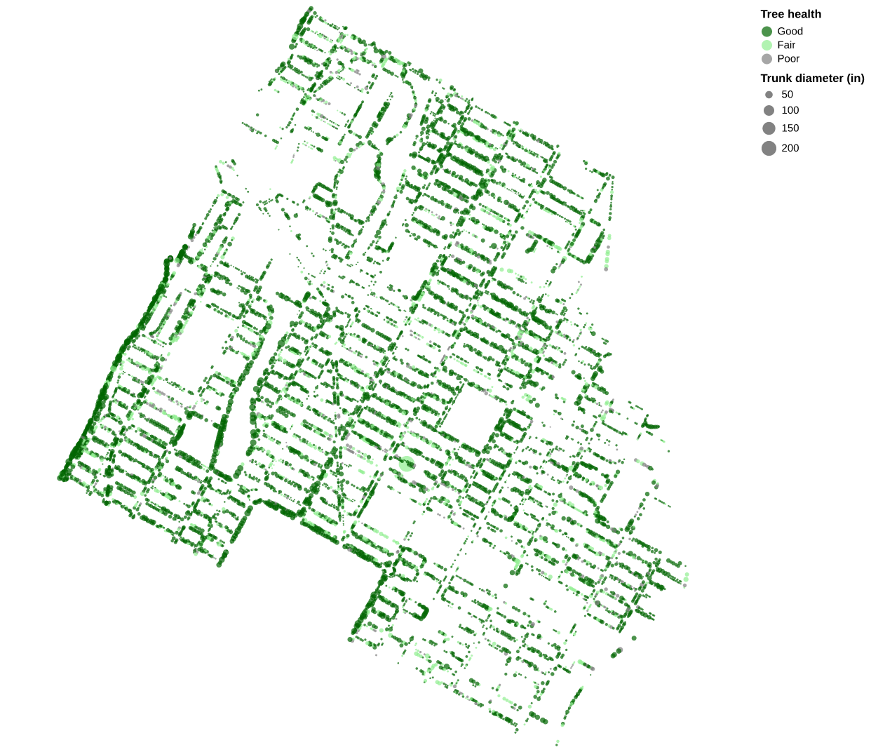
Notice how the outlines of streets are visible in the patterns formed by the trees. It is also clear that some blocks have many trees and others have very few. This is A View of NYC Trees #4 from the QGIS tutorial (a map of trunk diameter by tree), which we are making out of order because it is the quickest one to draw here.
Adding and mapping census blocks
Now let's add our census block geopackage. Copy this code and run it. Here we are reading the geopackage into a geo data frame, or gdf, and projecting it to epsg=4326 so that it lines up with the trees in Altair, which expects longitude and latitude.
gdf_Blocks = gpd.read_file('/content/nycb2010_um.gpkg').to_crs(epsg=4326)

gdf_Blocks
Same as before, you should see a dataframe (gdf_Blocks) of the dataset. You'll notice one key difference with df_StreetTree: The final column is called geometry, and contains a multipolygon.
Let's go ahead and map this real quick, just white fill and black lines will do:
chart_Blocks = alt.Chart(gdf_Blocks).mark_geoshape(
    stroke='black',
    strokeWidth=0.5
).encode(
    color=alt.value('white')
).project(
    type='mercator'
).properties(
    width=700,
    height=700
)

chart_Blocks
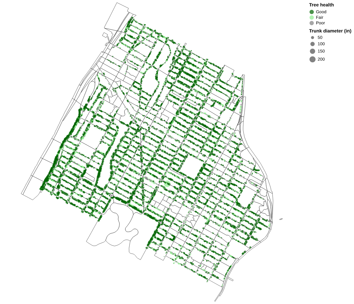
One of the nice things about Altair, is that because we have been naming these charts, they are very easy to reference again later. Here we will combine the last two maps we made, simply by combining them into a new one:
combined_Chart = chart_Blocks + chart_StreetTree

combined_Chart
You should end up with the map below.
Spatial Join: which census blocks have the most street trees?
Our goal is to understand the variation in the number of street trees by block in New York City. Specifically we are aiming to answer the research question: which census blocks (in Morningside Heights and Harlem) have the most street trees? and which census block has the largest proportion of mature street trees (as determined by trunk size)?
To answer this question we will perform a spatial join between the 2010 census blocks and the street trees.
A spatial join is an analysis operation that allows you to associate attributes from one dataset with the attributes of another dataset based on some spatial relationship between the two datasets. It is a simple but deeply powerful analytic tool that is not possible without geographic information systems. Remember that vector spatial data is comprised of two core components: geometry and geographic information (what you see on the map) and a table of attributes corresponding to each geometric/geographic entity. In performing a spatial join we are able to add information from one dataset to the attribute table of another dataset based on how they are related to one another in space even when we have no other information about how the two datasets are related to one another.
Take our street trees and census blocks as an example: we are hoping to learn which census blocks have the most street trees. If you look at the columns of the census blocks dataset you will see that there is currently no information about street trees present. Likewise if you look at the street trees dataframe you will notice that there is no information about which census block the tree sits within. So in order to determine how many trees fall within each census block we will need to perform a spatial join to associate attribute information about our street trees with the attributes for each census block.
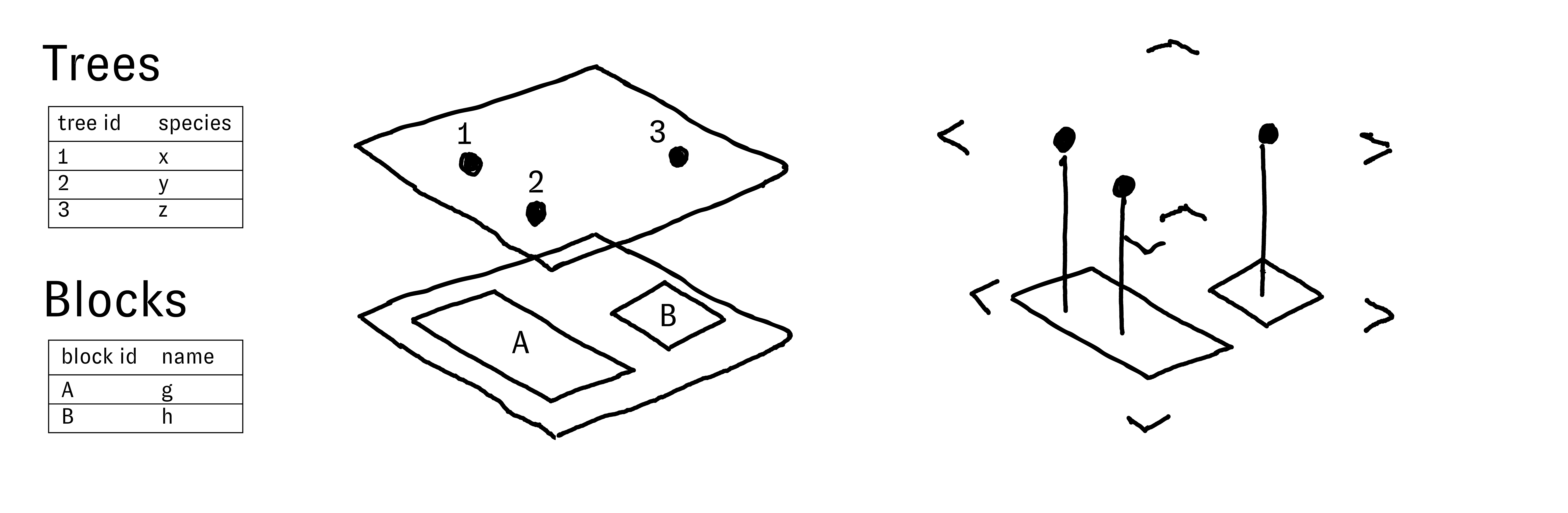
Before we execute a spatial join for the first time, consider the diagram below to have a stronger conceptual grasp of spatial joins. The diagram shows the geometry and the attribute tables for two layers: trees and blocks. There are three trees and two blocks. The trees and the blocks are spatially co-located so it is possible to perform a spatial join between the two layers.
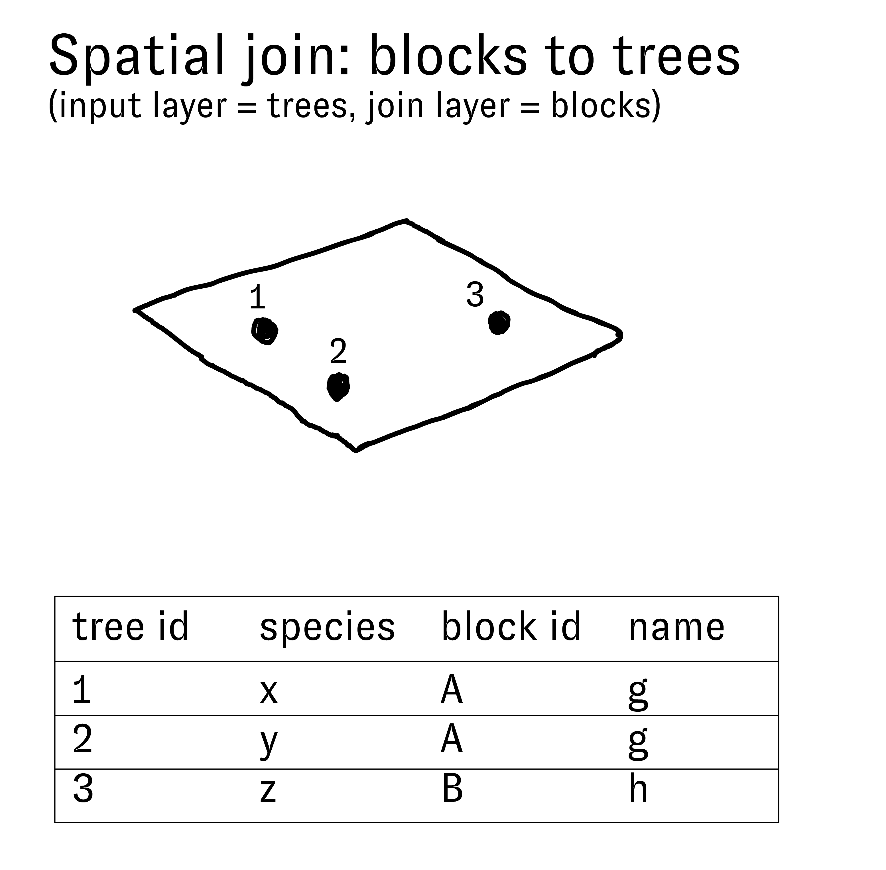
The diagram at the right shows the results of a spatial join from the dataset of blocks to the dataset of street trees. This operation results in adding new information to the attributes of each tree based on which block each tree overlaps. In other words we will add new columns to the attribute table for the street trees and the values in these new columns will correspond with the attribute information for the block that each tree grows within.
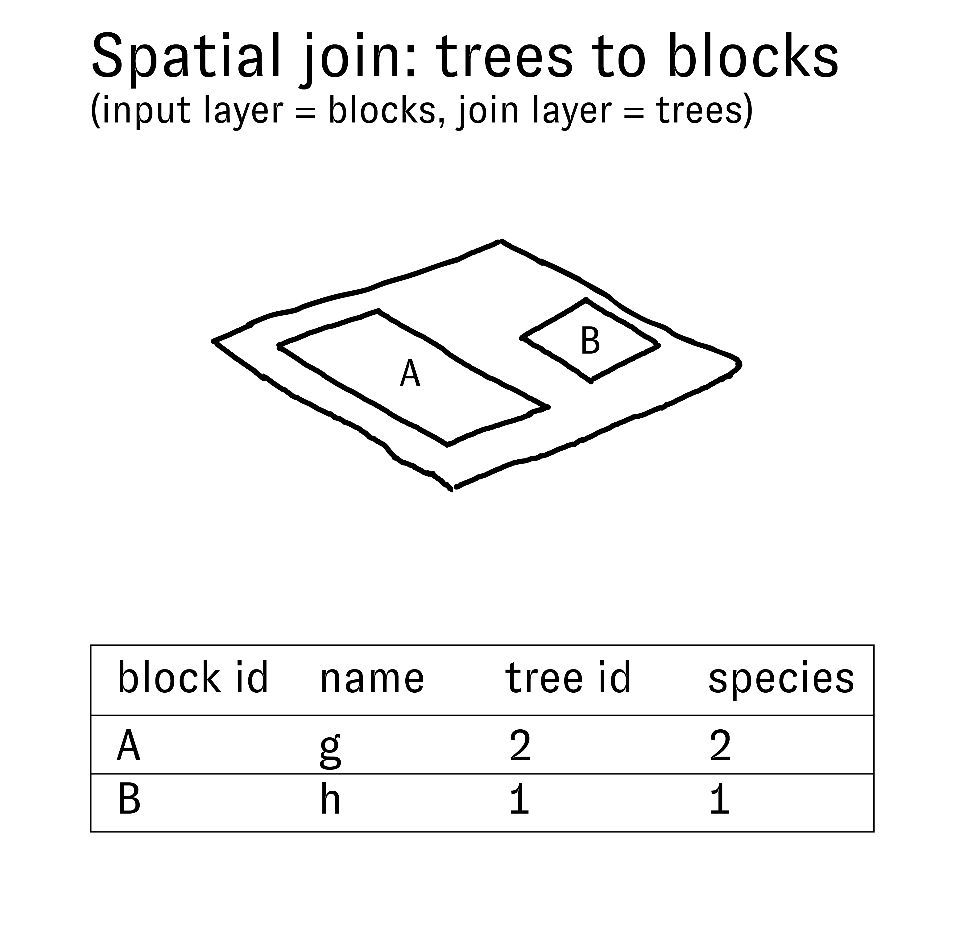
If instead, we join the street trees to the blocks we will add new information to the attributes of each block based on the attributes of the trees within that block. The diagram to the left illustrates these results. In this scenario however there are multiple trees within each block. Because each block corresponds with exactly 1 row in the attribute table this means that we must summarize the information about the trees that we are joining to the blocks. In this example we have chosen to count the trees, however a number of other summary methods could have been used for any numeric values in the dataset (minimum, maximum, average, etc.).
This second version of the possible spatial joins between these two datasets is what we need to execute in order to find an answer to the questions: which census blocks have the most street trees? which blocks have the most mature trees (as measured by trunk diameter)?
Spatial Join in action
In QGIS this was one tool, Join attributes by location (summary). In geopandas we get there in two steps: first the join from blocks to trees (every tree gets its block's columns), and then a groupby that summarizes the trees for each block. Let's go line by line here, don't copy this code just yet:
This line will perform the spatial join itself with a function called sjoin. We will give the function our two dataframes, and specify how='right' and predicate='contains'. In order, right means that we will keep the structure of the dataframe on the right (gdf_StreetTree), meaning that in the end we will have block information joined to every row of our street tree dataset. predicate='contains' specifies what spatial operation we want the function to use - in this case we do contains because we want all of the instances where points fall within the polygons. If we had a different geometry other than points, we may choose intersects or something else depending on the kind of information we wanted to create.
gdf_joined = gpd.sjoin(gdf_Blocks, gdf_StreetTree, how='right', predicate='contains')
After we join the datasets, we will make a new dataset out of just the blocks, with the amount of trees in each block and the sum of the tree diameter field. The blocks table has a column BCTCB2010, which is the borough, tract and block number run together into one id for each block, so we will group on that. (The tree census has its own column called block_id, which is something else, so don't use that one.) We're going to do this all with the groupby function. Select count and sum as the summary methods. This will mean that you add two new columns to the blocks: a count and a sum of the tree diameter field for each block. (It is a good practice to anticipate the results of each step you perform this way, if the results are different than what you anticipated you will notice and be able to more easily troubleshoot any errors).
df_counts = gdf_joined.groupby('BCTCB2010').agg(
    tree_count=('tree_id', 'count'),
    tree_dbh_sum=('tree_dbh', 'sum')
).reset_index()
The last line I will include with the full code. It creates a new dataframe by merging those columns back into our original blocks dataframe. As a side note, we have been essentially creating new dataframes at every step instead of editing existing ones - that is just a way of working with pandas and geopandas that will result in less errors. You will notice a warning if you ever try to essentially overwrite a dataframe with an edit. It will work, but if you do it many times it could cause problems down the line.
Okay, here is the full code for joining the dataframes and printing the result. Go ahead and copy this into your programming environment.
# Perform spatial join using sjoin
gdf_joined = gpd.sjoin(gdf_Blocks, gdf_StreetTree, how='right', predicate='contains')

# Group by block and count the trees and sum their diameters
df_counts = gdf_joined.groupby('BCTCB2010').agg(
    tree_count=('tree_id', 'count'),
    tree_dbh_sum=('tree_dbh', 'sum')
).reset_index()

# Merge the summaries back to the block GeoDataFrame; blocks with no trees get 0
gdf_TreeBlocks = gdf_Blocks.merge(df_counts, on='BCTCB2010', how='left')
gdf_TreeBlocks[['tree_count', 'tree_dbh_sum']] = gdf_TreeBlocks[['tree_count', 'tree_dbh_sum']].fillna(0)

gdf_TreeBlocks
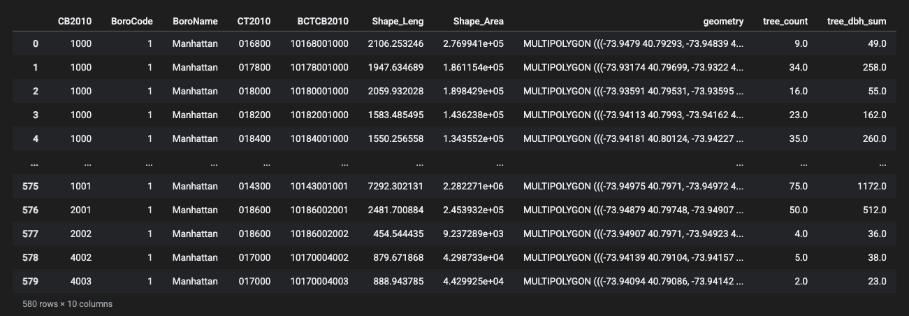
You should end up with a dataframe like below. This new dataset has the geometry of the census blocks and two new columns that summarize information about the street trees.
Calculating new fields
So that we can distinguish between blocks with many small trees and blocks with mature trees we will calculate a new field to give us the average tree diameter for each block. In other words, for each block we will calculate the value of total tree diameter / total number of trees.
In QGIS this was the field calculator. In pandas a new column is one line:
gdf_TreeBlocks['avg_diameter'] = gdf_TreeBlocks['tree_dbh_sum'] / gdf_TreeBlocks['tree_count']
You should see the new avg_diameter field added to the dataframe. You can sort the dataframe by any field with sort_values. Sort it to find out:
gdf_TreeBlocks.sort_values('tree_count', ascending=False).head(10)
- Which census block has the most street trees?
- Which census block has the highest total street tree diameter?
- Which census block has the largest average trees?
Quantitative symbology: average street tree diameter by block
Now that we have created information about the number of street trees on each block we can visualize this information through the symbology of our map drawing A View of NYC Trees #2.
First we will visualize the average tree diameter per block through a choropleth map. Blocks with a higher average tree diameter have on the whole larger or more mature trees. Here, we will use the mark_geoshape operation with Altair to style our map as choropleth. We will style a color gradient driven by the avg_diameter field, and mark the block id and number of trees on the tooltip. As before, we'll specify mercator and the size of the chart.
chart_TreeDiameter = alt.Chart(gdf_TreeBlocks).mark_geoshape(
    stroke='black',
    strokeWidth=0.3
).encode(
    color=alt.Color('avg_diameter:Q', scale=alt.Scale(scheme='greens')),
    tooltip=['BCTCB2010:N', 'tree_count:Q', 'avg_diameter:Q']
).project(
    type='mercator'
).properties(
    width=700,
    height=700
)

chart_TreeDiameter
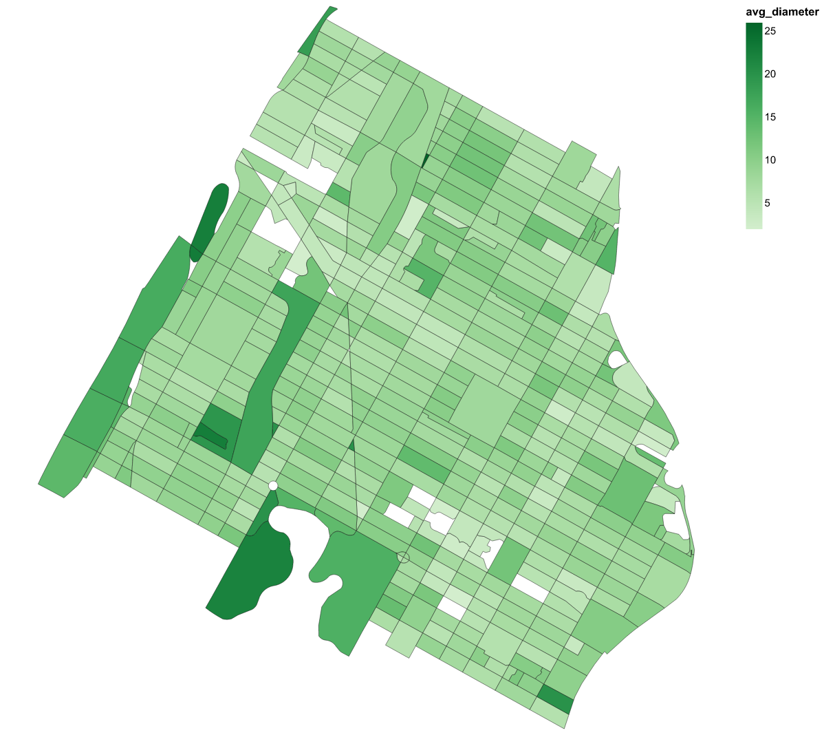
The blocks drawn in white are the 99 blocks with no street trees on them. Their
total diameter and their tree count are both zero, and dividing zero by zero
gives NaN, which Altair leaves unfilled.
In QGIS, the classification mode determined the groups that your data are assembled into, and the classification mode you choose will greatly influence the argument that your map conveys. Altair's default is a continuous color ramp, which is also a choice. Compare it with a quantile classification by swapping in this line and running the cell again:
color=alt.Color('avg_diameter:Q', scale=alt.Scale(scheme='greens', type='quantile')),
For more on data classification see Mark Monmonier's How to Lie With Maps.
On your own
Map A View of NYC Trees #3: How does the average tree diameter per block compare with the total number of trees per block?
Copy the cell above, name the chart chart_TreeCount, and change avg_diameter to tree_count in both places. chart_TreeDiameter | chart_TreeCount will put the two side by side. What are some of the differences you see?
Final Map
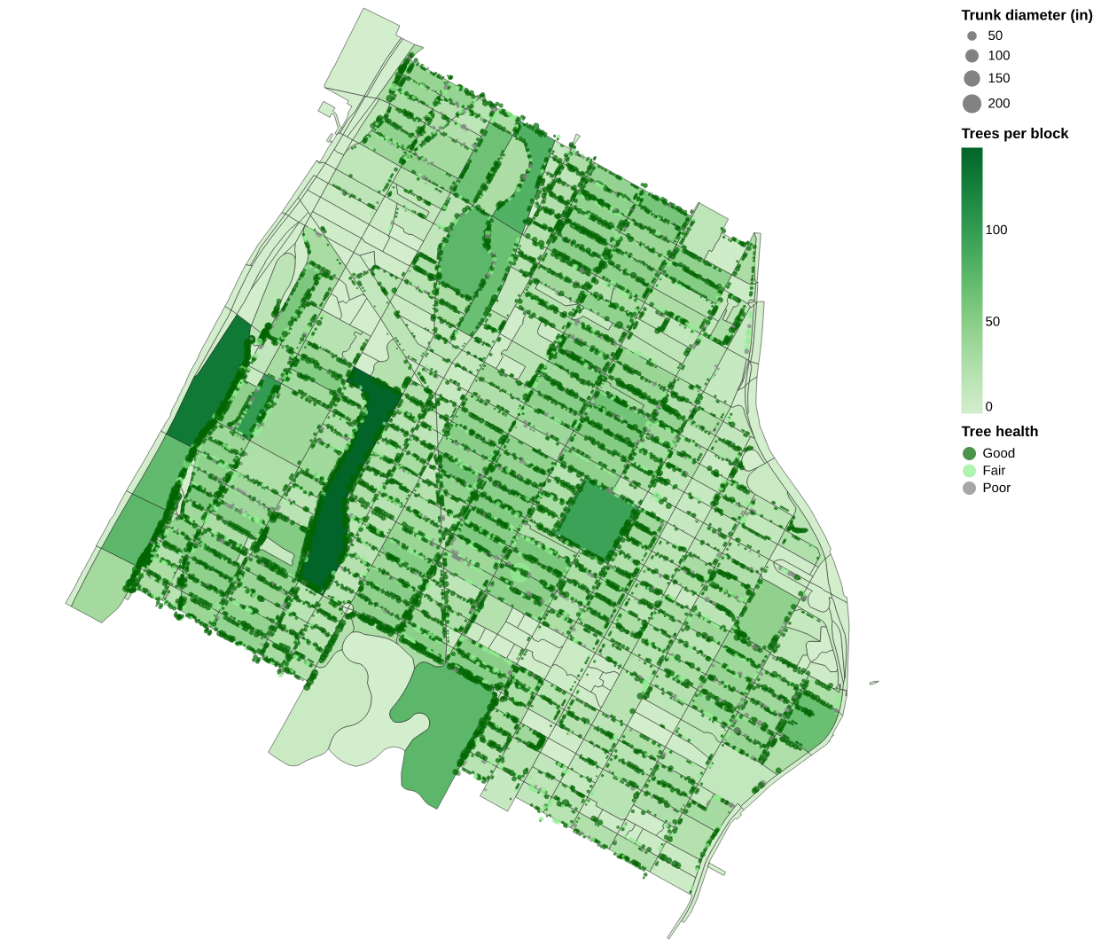
Now let's create our final map, which is just our blocks with amount of trees, with trees overlaid on top. For this, we can take advantage of one of the best features of altair again, which is just creating a new map by combining the saved names of the previous ones:
Final_Chart = chart_TreeCount + chart_StreetTree

Final_Chart
That's it! Your final map should look like this:
Reflection
Compare the canopy percentage from the raster at the top of the tutorial with the street tree count for the same area. The two datasets describe the same trees and give different answers. The land cover raster classifies every cell from imagery, so it includes trees in parks, yards and cemeteries, and it cannot tell one tree from another. The tree census records trunks along streets, one at a time, from volunteers with tape measures, and does not include anything behind a fence. Each dataset was made by particular people for a particular use, and the documentation for each says what that use was. Which dataset you choose is a large part of the argument your map makes.
Assignment 2
Two datasets, a site, and a map. Details on the assignment page. Due 9/24.
Module by Dare Brawley, fall 2021. Updated by Adam Vosburgh, Spring 2024 (Python). Combined for Fall 2026.